THE BRIEF
- Branding for a Japanese Sando Sandwich brand
STRATEGY & DESIGN
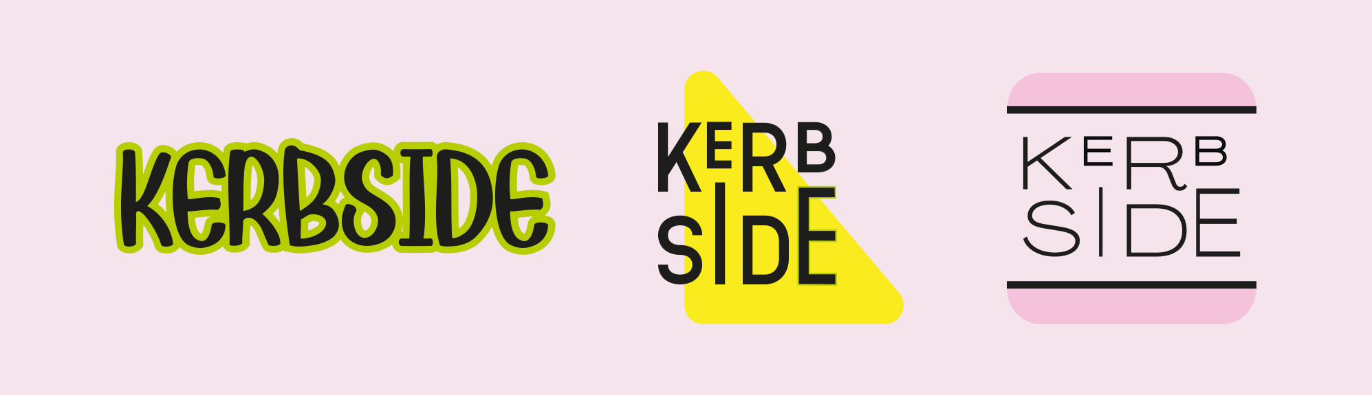
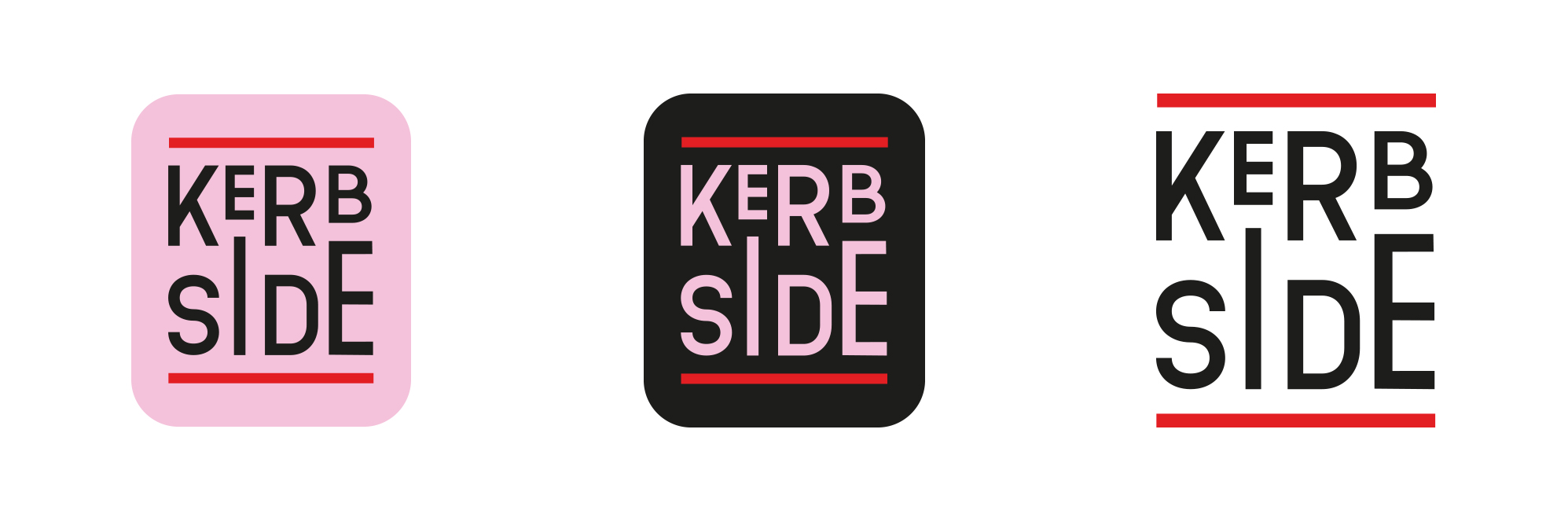
The minimalist and clean design of the logo aligns with the aesthetic preferences of many Japanese brands, which often favor simplicity and elegance.
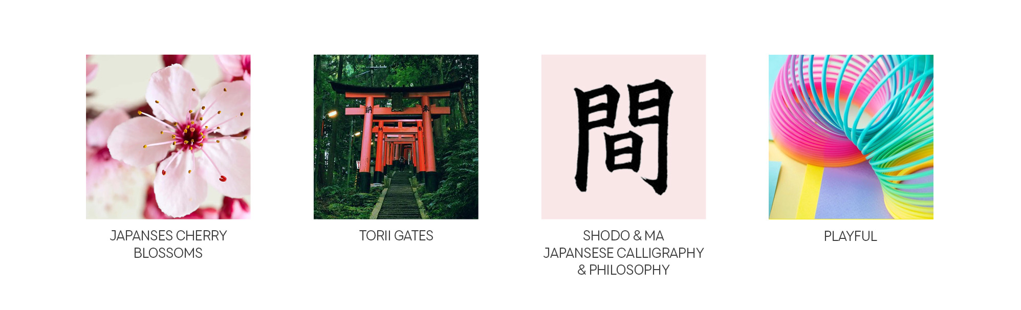
- Ma (間): This concept, referring to the space between objects, is essential in Japanese aesthetics. The balanced spacing and alignment in the logo create harmony and reflect the importance of balance in Japanese culture.
- Typography: The bold, geometric typography modernly interprets traditional Kanji characters, creating a subtle cultural linkage and making the logo feel contemporary yet rooted in tradition.
- Calligraphy (Shodo): Japanese calligraphy emphasizes precision and beauty in each stroke. The meticulous arrangement of the letters in the logo reflects this dedication to craftsmanship and detail, suggesting that the sandwiches are made with similar care.
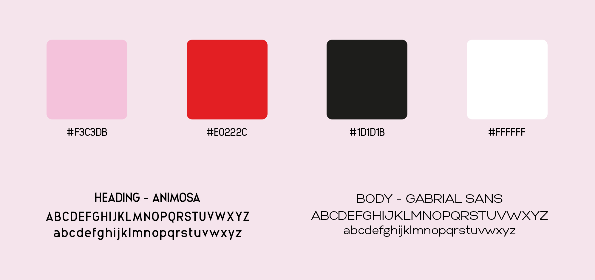
- Pink (Sakura): The use of pink evokes cherry blossoms, symbolizing beauty, renewal, and the fleeting nature of life. This connection can evoke feelings of joy and appreciation for transient moments.
- Red (Aka): The red horizontal lines in the logo can be seen as a visual reference to torii gates, which are traditional Japanese gates commonly found at the entrance of Shinto shrines. Torii gates symbolize transition and the entry into sacred space, evoking a sense of respect, tradition, and cultural depth. This connection adds a layer of cultural richness and significance to the logo, aligning it with the idea of a journey or experience, much like enjoying a well-crafted sando sandwich.
The logo subtly nods to traditional Japanese aesthetics while embracing modernity, appealing to customers who value both tradition and contemporary design.