Rahul Reddy & Co. is a Hyderabad-based interior design and contracting firm known for its sharp execution and detail-driven spaces. Led by founder Rahul Reddy, the studio blends architectural intelligence with on-ground construction expertise — creating residential and commercial spaces that are grounded, contextual, and functional..
THE BRIEF
Rahul Reddy & Co. approached us as a fast-growing interior contracting studio needing a full visual overhaul. With an expanding clientele and a reputation for precision-driven work, they needed a brand identity that felt confident, modern, and true to their architectural roots — but with a distinct personality. The goal was simple: feel young, sharp, and structured — just like the spaces they build.
The Approach
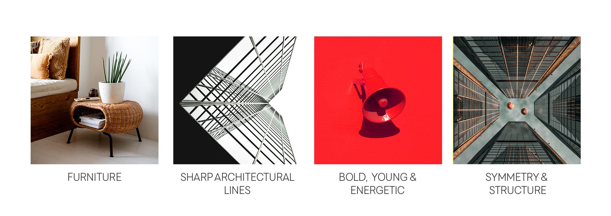
Our discovery process revealed a gap between their executional excellence and how they visually presented themselves. To bridge this, we focused on a brand system rooted in:
- Symmetry & Structure
- Sharp Architectural Lines
- Energetic Red Accents
- Professional Polish Meets Personality
We brought together the firm’s architectural rigour and youthful energy into a visual identity that speaks directly to both B2B clients and homeowner audiences.
The Design System
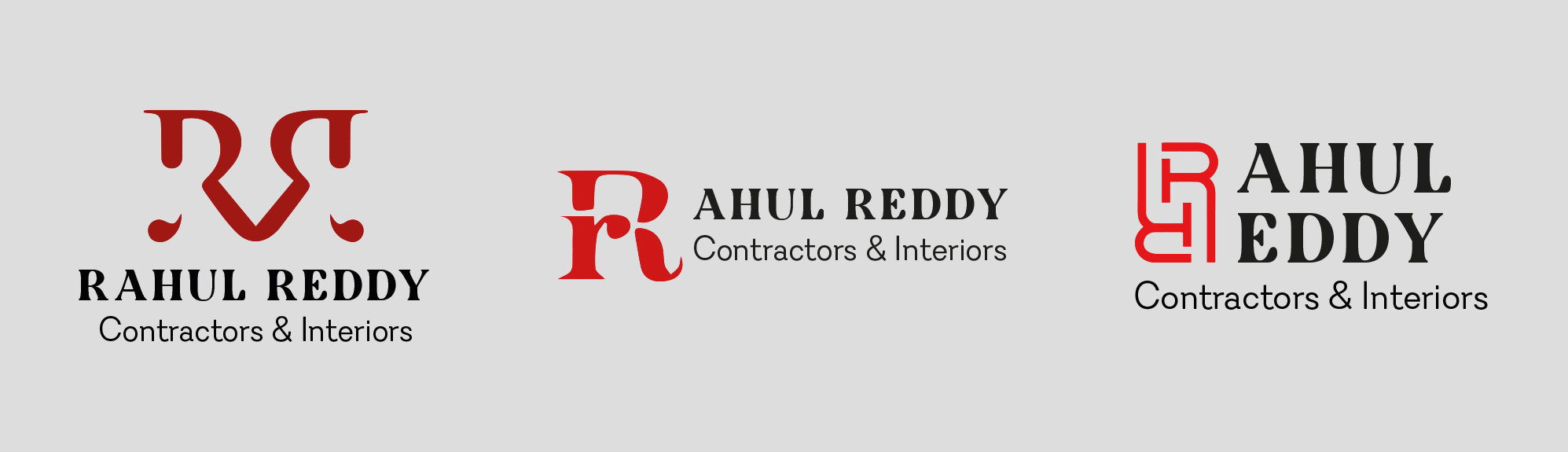
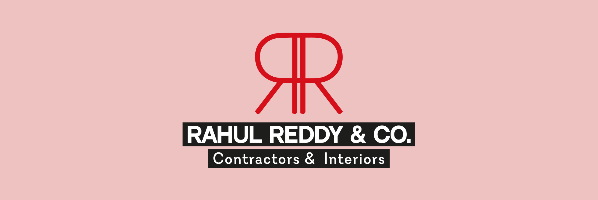
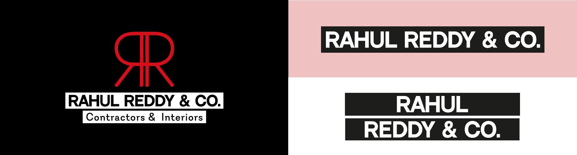
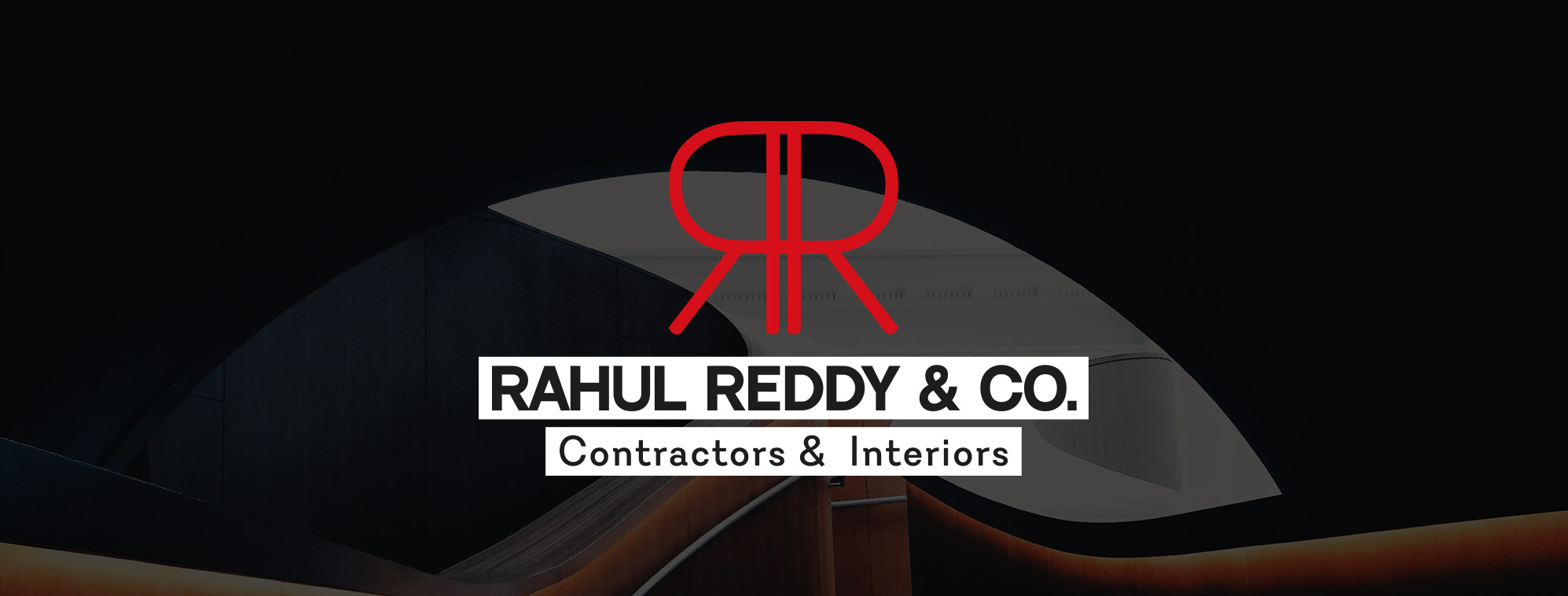
- Logo & Monogram:
The final mark combined symmetry, precision, and motion in a distinct RR monogram — crafted with a custom grid. The forms nod to floorplans and construction lines, while feeling bold and ownable in both digital and physical contexts. - Typography:
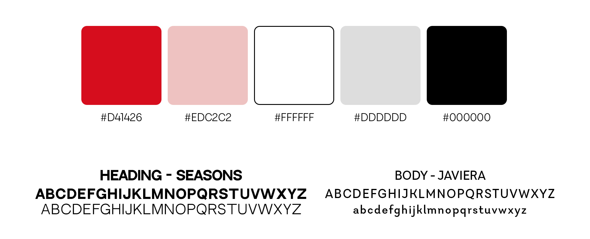
Headings use ‘Seasons’, a typeface that feels grounded but not dated. Body copy is set in ‘Javiera’, a clean, legible font that balances structure with warmth. - Colour Palette
Fire Red (#D41426): Bold, high-energy, and commanding
Blush (#EDC2C2): A soft contrast to temper the red
Greyscale & Black: Clean, neutral backgrounds to let the identity shine - Visual Language
Iconic use of black boxes to house text
White space and bold typography for clarity
Consistent grid structures across brand touchpoints
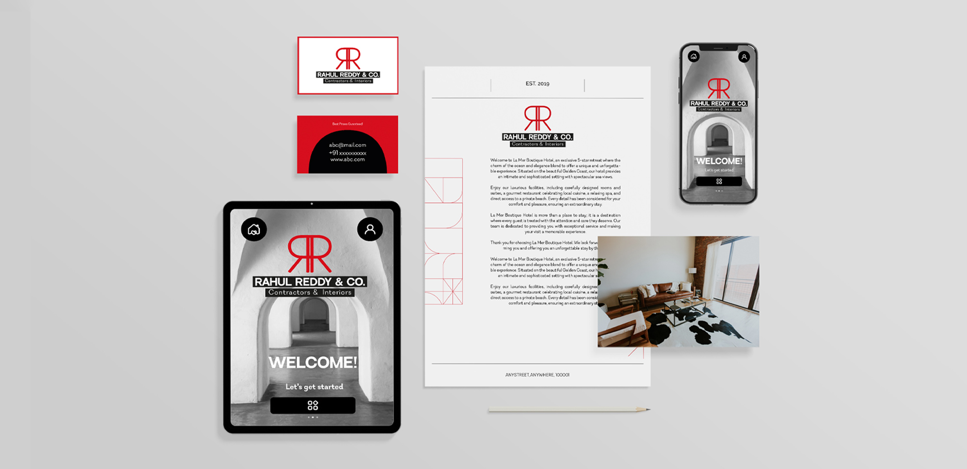
Translation
We extended the identity across:
- Digital touchpoints: Mobile-first UI previews for a landing site
- Collateral: Business cards, letterheads, proposals
- Social-ready visuals: Branded layouts for future announcements
The design direction ensures they’re set up to scale their communication, whether it’s a site pitch or an Instagram launch.
Outcome
The new identity system brings clarity, boldness, and consistency — repositioning Rahul Reddy & Co. not just as contractors, but as collaborators who build with intention and aesthetic discipline.
It now speaks confidently to architects, real estate firms, and interior studios alike — and carves out a visual space that is recognisably theirs.