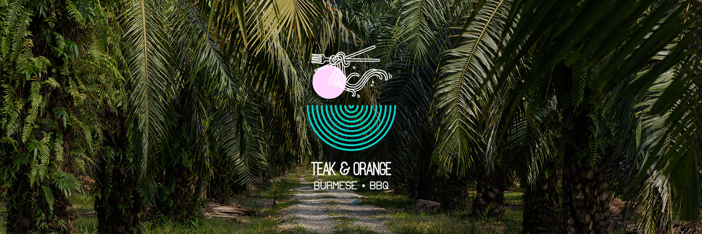
World War II, gave over 300,000 ethnic Indians in Burma a reason to call India home. Tamils, Telugus and Sikhs amongst many made their way back, a hasty retreat yet the taste of Home followed Home and on to the tables of few like myself. Teak & Orange brings our favs to you and your favs!.
THE BRIEF
- To develop the branding and identity for the hospitality brand
STRATEGY & DESIGN
For the logo we wanted to create something that represents both the Burmese cuisine and BBQ takeaway and delivery. We also wanted it to depict the catering side of the business as well. For this purpose we decided to take an illustrative route that encompassed all these elements.
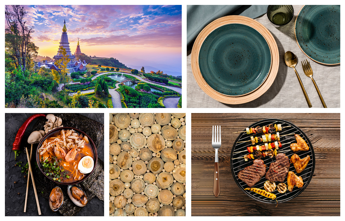
BRAND VALUES, ASSOCIATED KEYWORDS & MOODBOARD
Burma Architecture • Catering Dining & Setup • Burmese Cuisine • BBQ Food • BBQ Dining Setup • Colour Scheme
LOGO OPTIONS BASED ON THE MOODBOARD
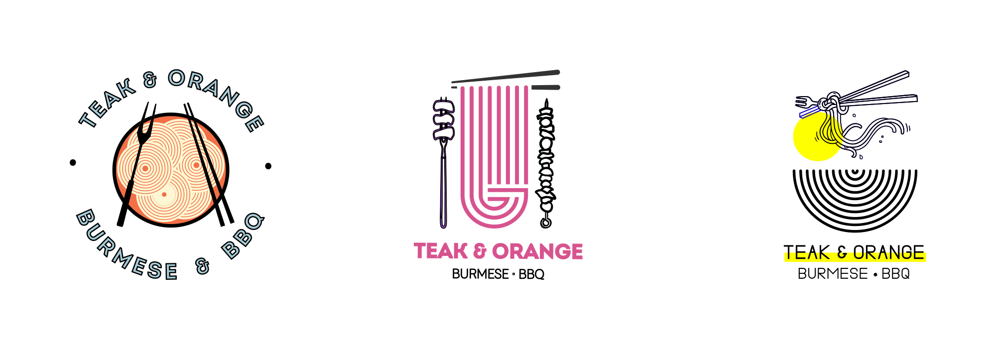
LOGO ROUTE SELECTION & ITERATION
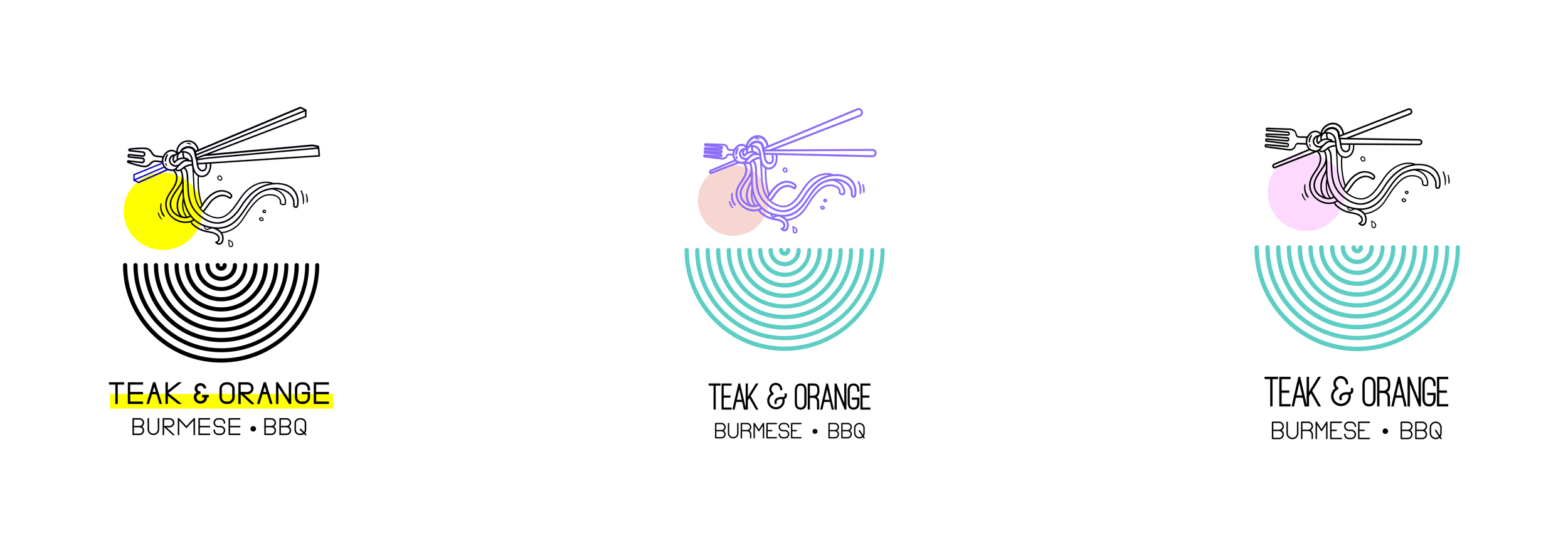
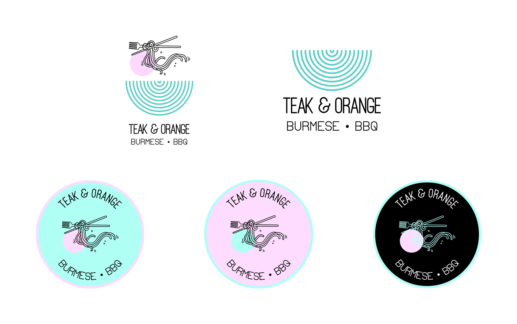
LOGO ROUTE FINALISATION & SECONDARY LOGOS
LOGO STRATEGY & TRANSLATION
The logo is inspired by all things Burmese, BBQ and Private Catering. The semi circular illustration represents various courses in a fixed meal. It represents dining by plates being stacked on top of each other. The cutlery in dining represents cuisine. The chopsticks and noodles represents Burmese while the pitchfork represents BBQ. The noodles represent the food aspect of Burmese while the pink circle represents meat aspect of BBQ.

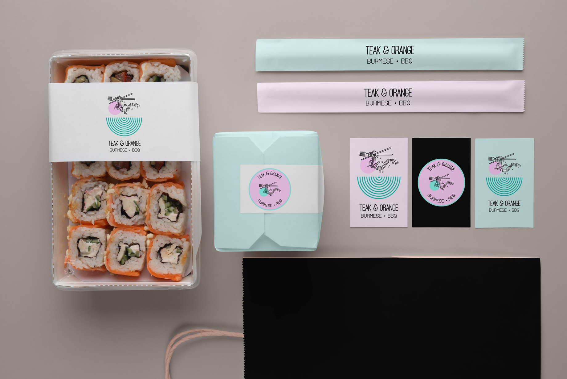
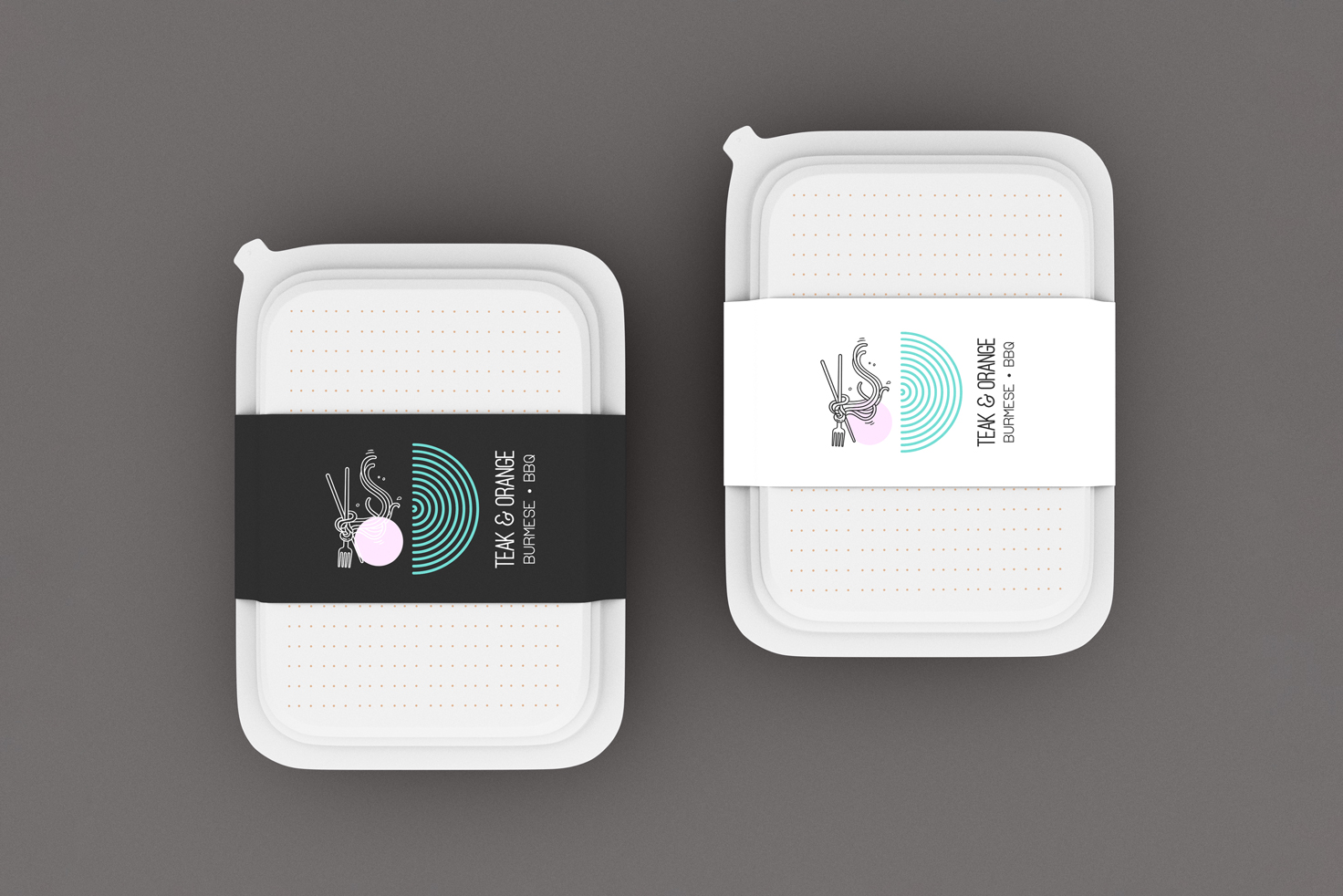
MOCKUPS
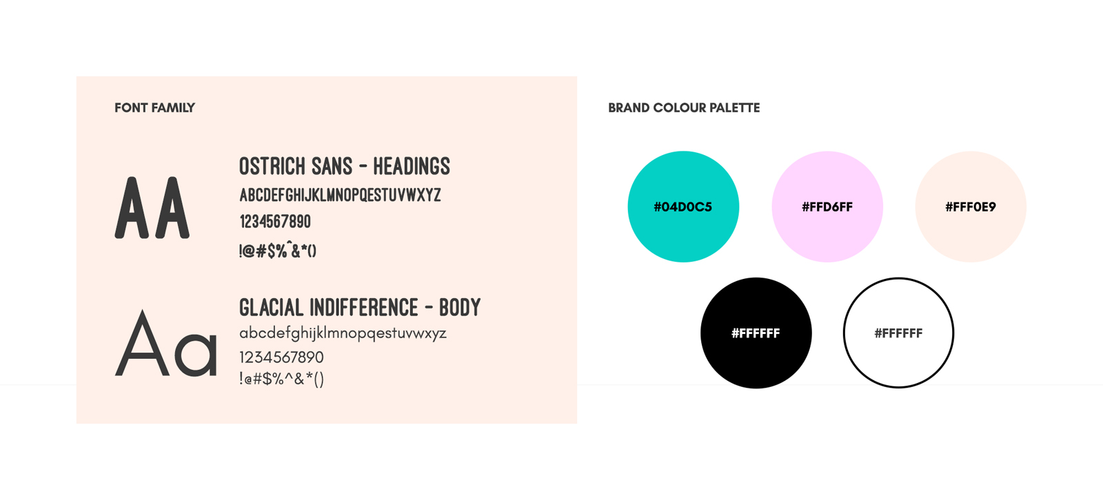
BRAND COLOUR PALETTE & TYPOGRAPHY